Wet n Wild Spring into the Wild Collection (Spring 2016)

So, I did something I don’t think I’ve ever done before.  I bought an entire collection.  I just have never been able to justify it before.  An entire collection of China Glaze or OPI can easily cost north of $50, and often I don’t really need or want all of the polishes.  I love reading blogs or watching videos made by ladies who have purchased entire collections, but for me it just seems a little frivolous, especially since my little blog doesn’t actually generate any income.   So how did I come to purchase an entire collection, then?

IMG_7089Well, we (my hubby and some other extended family members) had been putting in lots of long exhausting hours cleaning out a house for another family member.  After several days of working, working, working, I ended up in a Christmas Tree Shops staring at the newest Wet n Wild collection called Spring into the Wild.  The display still had all four of the polishes in it, and they were pretty… And they were only $1.79 each.  That meant for under $8, I could get the entire collection.  So I did.   Seriously, aren’t they so pretty?

A day or so after I bought this collection at Christmas Tree Shops, I spotted it atIMG_7091 Kmart.   While I was there, I looked through Sinfull Colors, Sally Hansen, and Revlon for any duplicates (aka “dupes”) of these colors.

The four polishes are from left to right:  Love Fest, Lay out in Lavender, Breeze on By, and Kiss My Mints.

Let’s start with Love Fest.  This is just a lovely pastel pink.  Next to the other polishes in the collection, it looks like it’s pretty warm IMG_7093toned, but when it’s on its own, I feel it’s almost cool toned.  I’ll just say it’s a middle-of-the-road pastel pink.  The formula is pretty sheer, though.  What you’re looking at here is four coats.  Yeah, I know.  Ain’t nobody got time for that.   It dries really glossy and it just looks so pretty once it’s on the nail, so I’ll probably suck it up and wear it anyway.   I think I might attempt some jelly sandwiches with this one.IMG_7103

I have a ton of pink polishes (well, like 30) but I didn’t have any that were a really close match to this one.  The closest that I could pull out of my collection was Wet n Wild – Tickled Pink, but as you can see, these polishes really aren’t that close at all.

IMG_7133At Kmart, however, I did find two dead-on dupes for Love Fest.  Here’s Love Fest on the left, then in the Middle is Sally Hansen – Hard-Core Party in the middle, and Sally Hansen – Tickled Pink on the Right.  (Yeah, both the Sally Hansen polish and the Wet n Wild Polish are called Tickled Pick.  People need to come up with more clever names.) I picked up Hard-Core Party since it was only $.50, and I can definitely verify that these two are pretty much exactly the same.


IMG_7104
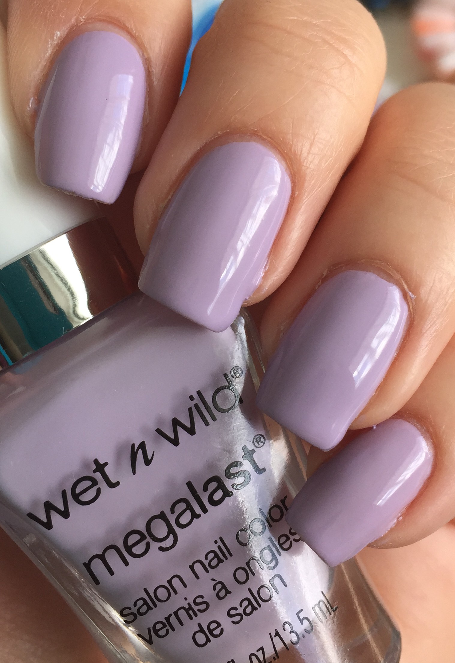
Next we have Lay Out in Lavender.  This one’s a stunner, right?  It’s just so pretty!  This is sort of a muted lavender.  This polish was opaque in two coats.  None of that four coat nonsense here.

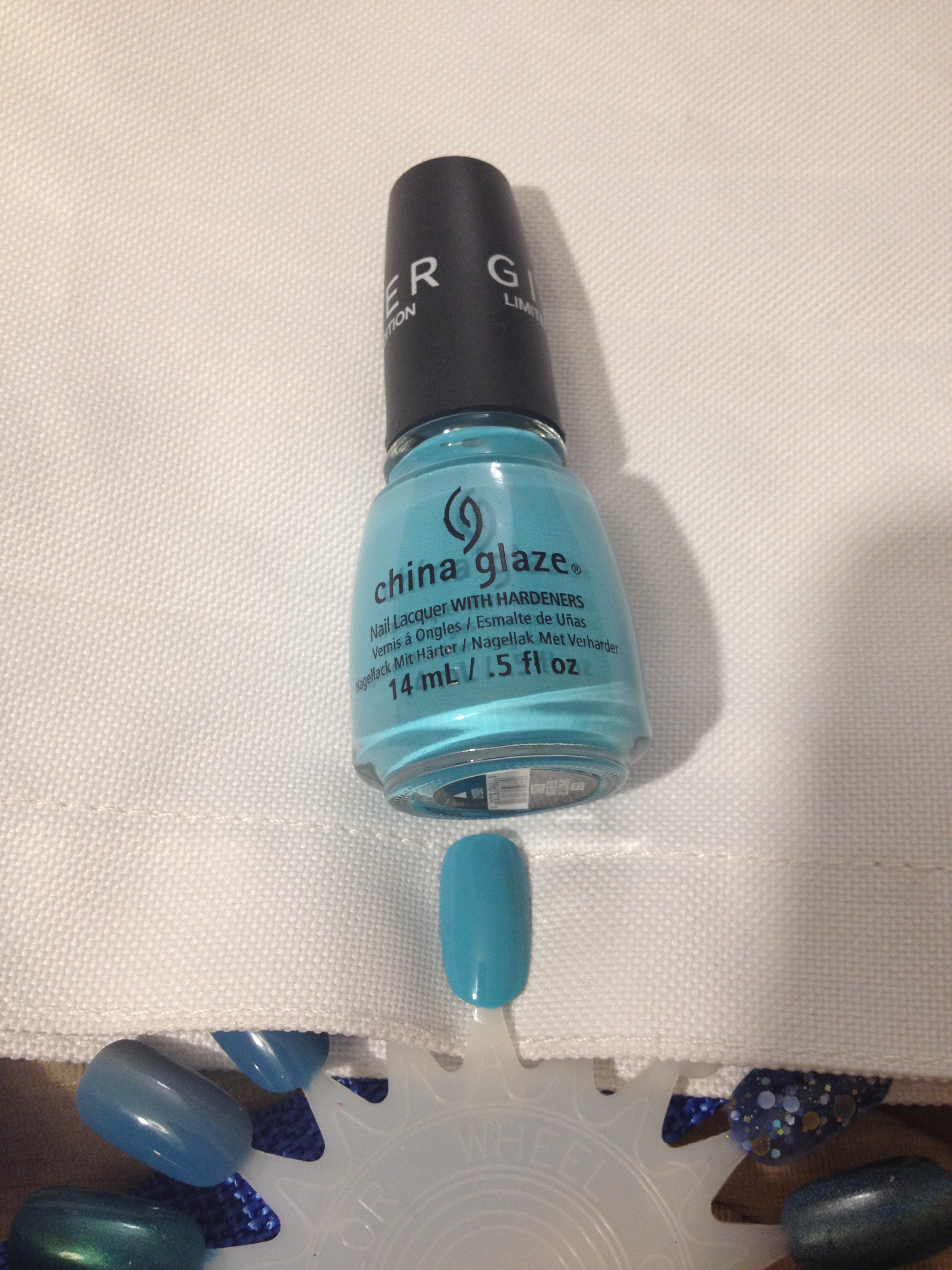
When I first saw this polish, I thought it might be similar to China Glaze – Release from IMG_7108The Giver collection from a few years ago, and when you look at them in the bottle, they actually don’t look that different.  Once I got the polish on the nail, it was clear that they were really different.  Release is a gray polish that leans purple, and Lay Out in Lavender is a purple polish that leans gray.

Just for kicks, I also pulled out Broadway Nails – Easter Annie for comparison, but this polish is obviously much more pink with no IMG_7136hint of gray.  I’m super happy to add Lay Out in Lavender to my collection since I really don’t have anything like it!

While I was at Kmart, I found a few polishes worth comparing to Lay Out in Lavender.  The polish on the left was the closest match, and that is Sally Hansen Miracle Gel – All Chalked Up.   All Chalked Up is just a tiny bit warmer than Lay out in Lavender, like it’s got a half a drop of yellow polish in the bottle.  It’s still super close, though.  The polish on the right is Sally Hansen – Lacey Lilac.  Lacey Lilac is definitely more pink and it doesn’t have that hint of gray that Lay Out in Lavender has.

IMG_7109Next we have Breeze on By.  This is a pretty periwinkle cream that was opaque in two coats.  Another really beautiful color!IMG_7092

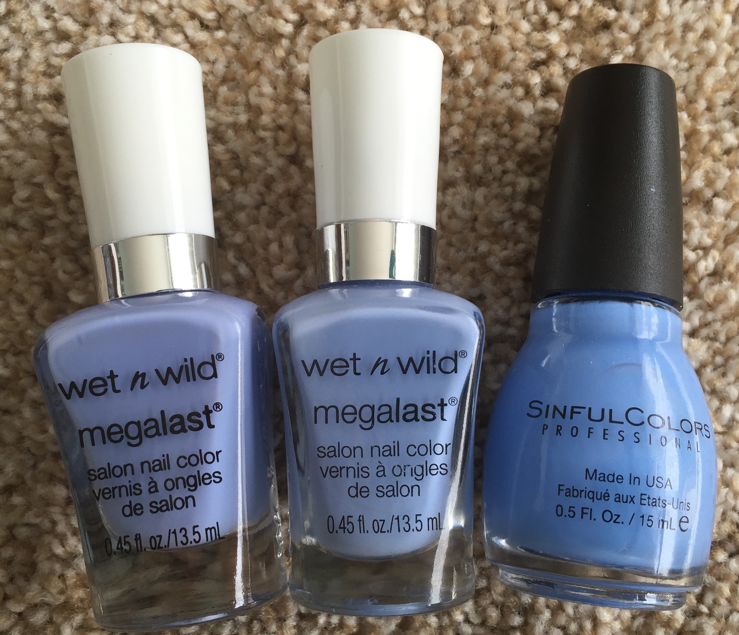
As soon as I saw this polish, I thought it looked exactly like Wear Skinny Jeans from last year’s Silver Lake Collection.  As you can see, they are pretty darn close.  The one difference is that Wear Skinny Jeans has a silver shimmer running through it, but since the shimmer doesn’t actually show up on your nail, that difference really doesn’t count for much.  I threw in Sinful Colors – Sail La Vie for comparison as well. I have Breeze on my on my first finger, Wear Skinny Jeans on my IMG_7113
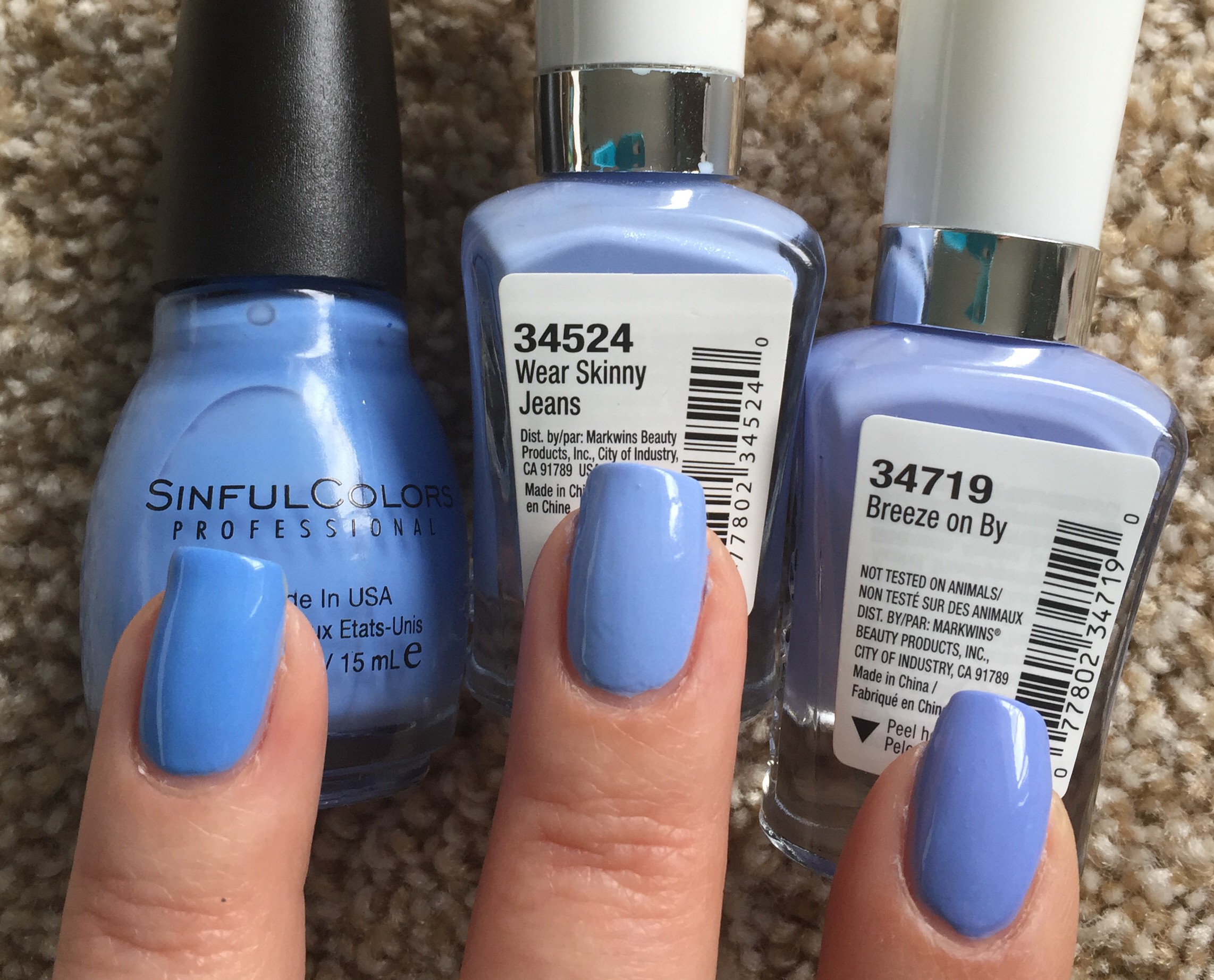
middle finger, and Sail La Vie on my ring finger.  As you can see, Breeze on By is a IMG_7114hint more purple than Wear Skinny Jeans, but if you already own Wear Skinny Jeans, I’d say you could skip picking up Breeze on By.  Sail La Vie is obviously more blue than either of the Wet n Wild polishes.  I’m sure that Essie – Bikini So Teeny is super similar as well, but I don’t own that one.  I know it’s a classic Essie polish, but I  seriously don’t need anymore periwinkle polish.

When I was at Kmart I found a few more polishes worth comparing to Breeze on By.  The polish on the left is Sail La Vie, which I just threw in the picture for comparison’s IMG_7130sake.  The next polish is Sally Hansen – Hard Bitten.  This is a little less purple than Breeze on By, and it has a fine silver shimmer.  I’m not sure if that shimmer actually shows up when you get it on your nails or not.  Next is Sally Hansen – Babe Blue.  Babe Blue also has a shimmer running through it.  From images I’ve seen online of this polish, the shimmer just barely shows up.  (Rant:  Why is it so difficult to make a periwinkle polish with a shimmer that actually shows up?  Am I missing something here?  Nothing is more annoying than purchasing a polish and then not being able to get what you see in the bottle to show up on your nails.) Babe Blue is really close to Breeze on By, maybe just a hair more blue.  I think it’s probably just about identical to Wet n Wild – Wear Skinny Jeans.

IMG_7116
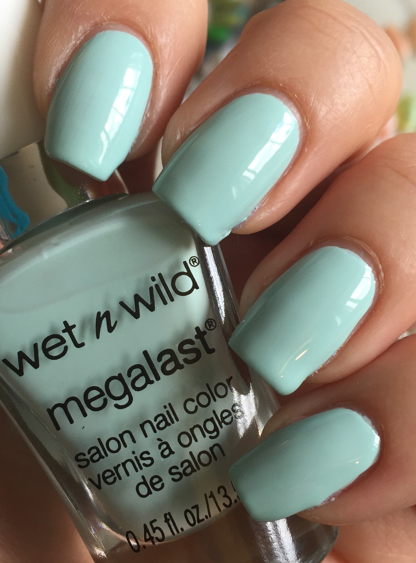
Now we come to our final – and maybe my favorite – polish of the of the collection: Kiss My Mints!  This is the most beautifully perfect mint color ever!  It’s not too green, not too blue.  I IMG_7121just love it so much! This is perfect in two coats and it’s just so pretty!!!

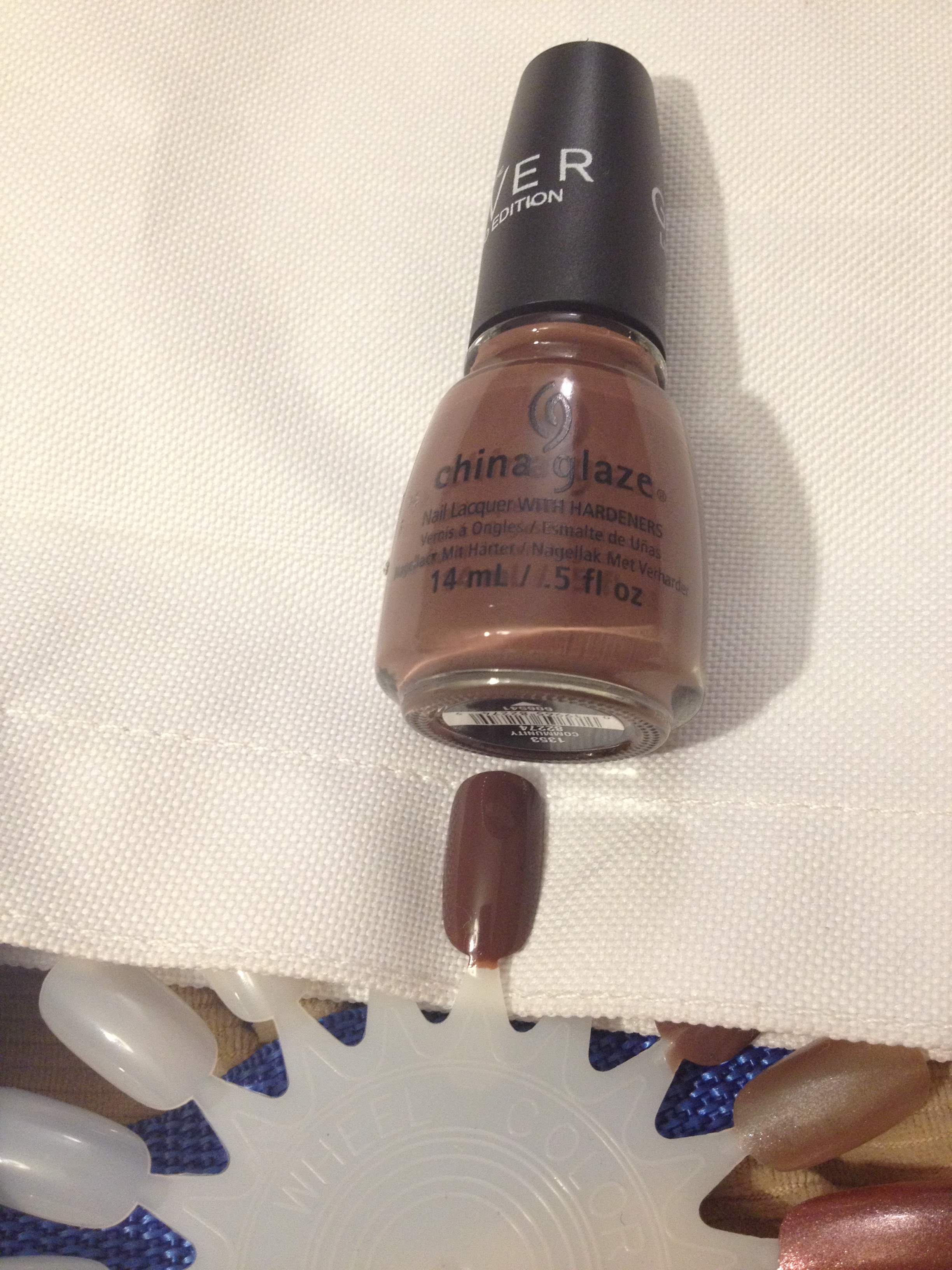
I compared this to three other polishes in my collection.  On my little finger is Wet n Wild – Tree Hugger from last year’s Silver Lake collection.  This polish is obviously much greener.  On my ring finger is Joe Fresh – Mint.  (Whoa, such a creative name.  My mind is blown!)  This polish is also more green than Kiss My Mints and it has a bit of a dusty gray quality to it, also.  On my first finger is China IMG_7144Glaze – For Audrey.  I knew this polish wouldn’t be a match, but it felt to me like Kiss My Mints is the exact same hue as For Audrey, only a lighter tint.  ( I had to check an art dictionary to make sure I was using “hue” and “tint” correctly.)  Petty much that means that if you added white polish to For Audrey, I think you’d get Kiss My Mints.

At Kmart, I found a few polishes worth comparing to Kiss My Mints.  The one on the left is Sally Hansen Miracle Gel – B Girl.  This one is really close to Kiss My Mints, maybe just a hair darker.  The polish on the right is Sally Hansen – Mint Sorbet, which is obviously much more green.  I just figured it was worth comparing since it had the word “mint” in the name and it’s readily available.

So, Here are my final thoughts…

  • Skip buying Love Fest and pick up one of the Sally Hansen polishes if you really love this color.  Nobody should be applying four coats of anything.
  • Lay Out in Lavender is really beautiful and different from most purple/lilac/lavender polishes that are out there.  I think this is a good one to grab.
  • Breeze on By is definitely pretty and it has a good formula, but it’s hardly unique.  Only pick this one up if you don’t have a periwinkle in your collection.
  • Kiss my Mints is awesome!  The formula is great, and although there are a lot of mint green/teal/aqua/turquoise polishes out there, this exact shade is still pretty unique.  If you’re only going to pick up one, I’d pick up this one.

Oh, and just one more thing.  Breeze on By and Love Fest are super close to the Pantone colors of the year for 2016, Rose Quartz and Serenity.  I’m sure that’s no accident.

Thanks for reading, if you made it this far!  Find me on instagram and Facebook!


January Favorites

Yes, I’m finally getting around to posting my January Favorites.  What had been a part-time desk job is now an almost full-time manual labor job.  (I had been working customer service for an online store, but we are in the middle of moving our warehouse, so I’m spending a ton of hours schlepping heaving boxes around.)  This has left me with less free time for blogging, and the free time I do have is now spent soaking in the bathtub attempting to recover.  Anyway, onto my January favorites…

IMG_4356

In the dead of winter, I find that I tend to get stuck in a blue/aqua/turquoise/teal rut with my nails…. Confession time:  I don’t really know the difference between aqua, teal, and turquoise.  Does anyone really?  I tend to think of turquoise as leaning more green, but the actual turquoise stone really isn’t green at all.  I would actually describe a turquoise stone as being aqua in color.  There’s proof that I don’t know the difference.

Anyway, one of the polishes in this color family that I’ve been loving is China Glaze – Capacity to See Beyond from the Giver collection.

IMG_4357IMG_4213

I found the entire Giver collections on clearance at Sally Beauty supply!  I didn’t actually buy the whole collection – just 3 – but I found the whole collection.  Anyway, this polish is just the prettiest cool blue color!  If Elsa painted her nails, it would be with this color.

Another beautiful polish from the Giver collection is Community.

IMG_4365

This is a lovely milk chocolate brown. Just for comparison, here it is next to NYC – Royal Chic.  Royal Chic (left) reminds me of Hershey’s syrup.  Community (right) is milk chocolate.  I think about chocolate too much.

IMG_4366

I paired Community here with another January favorite: Sinful Colors – Love Sprinkles, a pale pink glitter with white hearts.

IMG_4362IMG_4285

I was going for a chocolate candy look here.  Love Sprinkles is a limited edition polish for Valentine’s day.  I’ve seen it around at quite a few stores, so you should be able to track this one down pretty easily, if you want.

I also loved using Broadway Nails – Space Flight in January.

IMG_4361IMG_4259

I know, I can’t list this polish as my favorite every month, but it’s just such a pretty blue jelly! This look took a little bit of “frankenjelly-ing”.

Another favorite from January is Funky Fingers – Olaf.

IMG_4363IMG_4264IMG_4279

This is white glitter polish is perfect for jelly sandwiches!  There are some snowflake shaped glitters in there, but they are easy to avoid, so I think I will get year-round use out of this.

Also from Funky Fingers is Bezerk Turq.

IMG_4358IMG_4327

Based on the name, someone somewhere considers this turquoise.  I’d call it aqua.  Anyway, this polish is so bright that I almost want to say it’s neon.  I love that it’s super bright, but still appropriate for winter.  Just to show you how bright it is, here is my turquoise/aqua/teal nail wheel.  Bezerk Turq is at 12:00.  It’s definitely the brightest on the wheel.

IMG_4367

My final favorite of the month is….(drum roll, please)….  The much sought after and highly coveted L’Oreal – Masked Affair.  In the bottle it just doesn’t look like much, but when it’s on your nails… Be still my heart.

IMG_4364IMG_4305IMG_4305

This is a barely purple holographic polish.  Next to purple polish, it looks silver.  Next to silver polish, it looks lavender.  I found this polish at a Rite Aid, but I really felt like I couldn’t justify purchasing it.  Lucky for me, my birthday is in January.  I made the following deal with my hubby:  I buy the polish and then give it to him. Then on my birthday, he gives it back to me as a birthday gift.  So that’s what we did.

So, those are my January Favorites!  I’ve got some Valentine’s Day manis that I will definitely be posting this week, I promise!  Thanks for reading, and find me on instagram for even more nail polish fun!

My Fall 2014 Limited Edition Polishes

I just sort of realized that I’ve picked up a few limited edition nail polishes recently that I haven’t shared on here, so… Shame on me.  These are all drugstore polishes that cost about $2 each.  Really, I love a good polish, but I’m no snob.

I haven’t gotten around to wearing all of these on my nails yet, but if I wait until that day comes, these will be long gone.  The swatches that are next to the bottles are all two coats.

Let’s start with the Wet n Wild Megalast Matte collection.  There are 6 polishes in this collection, but I just grabbed the two that spoke to me the most.

This is Careful, It’s Vine-tage:

IMG_3924

This is a beautiful dusty purple in the bottle, but it does dry a good bit darker.  My swatch looks REALLY dark, but when it’s on the nail, it’s still clear that it’s purple, not black.

This is Echo Dark:

IMG_3913

This is a beautiful deep blue in the bottle, but on the swatch it really does look almost black.  The formula is a jelly, which seems weird for a polish with a matte finish.  I’m a little disappointed that it dries so dark.  I haven’t done a full mani of this yet, but I’m pretty sure that it will just look black once I have it on.  I wonder if I could make a jelly sandwich with this…  If I try that, I’ll let you know.

Next I have two polishes from the NYC Fashion Queen collection.  This collection of six polishes has been around for a few months, and I didn’t think I wanted any of the polishes…. Until I got a $1 off coupon.  That prompted me to pick up two.

Here’s Royal Chic:

IMG_3918

I highly suspect that this is a dupe for Essie – Little Brown Dress, but I don’t know for sure.  This looks like Hershey’s Syrup when it’s wet.  It’s such a rich chocolate brown!  It’s dark, but it is definitely brown, not black.  I used this as a base for my recent Golden Leafy Nails. I’m a little bit in love with this polish right now.

I also have Rule the City:

IMG_3925IMG_3928

This is a gunmetal grey micro-glitter polish with slightly larger red hex glitter.  The red glitter tends to stick to the sides of the bottle, so on the nail it looks like it has less glitter than it does in the bottle.  The finish is a little bit textured.  I have yet to wear this, but I’ll bet it would look super pretty with a shiny top coat…. It might even look awesome with a matte top coat.

Last I have Sinful Colors  – Prosecco.

IMG_3929IMG_3930

This is from the Sinful Shine line of polishes and the collection is called Shining Bright Off the Runway.  There are 8 polishes in the collection.  The display said, “5x more glossy that patent leather shoes!”  Who the heck comes up with stuff like that?  What kind of gloss-o-meter is used to determine that sort of thing?  Anyway…

After I bought this polish, I found out that it’s kind of the big deal color from this collection.  People out there are searching high and low to find it.  I found mine at Rite Aid, by the way.

I have actually worn this polish, but I was a dork and deleted, so you’ll have to check it out on my instagram.  I think I had to apply three coats to get good coverage.  It really is super shiny!  Because it’s sheer, you can sort of slop it on and it will still look good.  I actually didn’t love the color at first, but it really grew on me!  It’s a perfect color to wear when you need to look a little more professional for work or an event or whatever.

Okay, so that’s the end of that!

I’m looking for a little feedback from you.  Would you rather see a series of posts that are color themed (my favorite reds, my favorite pinks,…) or would you rather see posts that are brand themed (my favorite Sinful Colors, my favorite Wet n Wild,…)?  Or do you mostly just care about nail art?  Any feedback is appreciated!  Thanks for reading!

Day 5: Blue Nails (31cd2014)

I am no artist.  I watch videos of people like Robin Moses who can effortlessly paint these beautifully details designs on people’s nails with a little bit of envy and a whole lot of admiration.  I’m not gonna lie, these blue nails took a bit of time.  I probably spent close to 2 hours on them last night while the hubby controlled the remote.  He was flipping between baseball and tennis, both of which interest me very little, so I was happy to stare at my nails instead.

I started with Sinful Colors – Cinderella.

IMG_3086

This is a baby blue cream with a pink micro-shimmer.  It’s SO pretty!  It’s pretty sheer, so I did use 4 thin coats to get it opaque. 

After that was done, I started on my thumb and first finger.  After a long time, I ended up with this:

IMG_3090IMG_3092

And here’s the finished look!

IMG_3095

I’m going to be pretty sad when I have to take her off my nails tonight.  I think I’ll go with something a little simpler for tomorrow!  Come check out the 31 Day Challenge on instagram!  Use #31dc2014 and find me @polishmesnazzy !


August Favorites and the 31 Day Challenge

So, I only have 3 new polishes that I’ve particularly loved in August.  I guess  there’s nothing wrong with that.  

IMG_3025

The first is China Glaze Peonies & Park Ave from the City Flourish Collection.  I’m not really sure when this collection came out, but I think I got this polish on clearance last summer.  I’m pretty sure you won’t be able to find this in stores, but you can still buy it online.  It’s just a really pretty almost-neon pink.  I used it as the base for my scrapbook nails, and it was while I was wearing those nails that I realized how much I love this color.

IMG_3019IMG_3018

The next one is Sinful Colors – Snow Me White.  I keep not putting this polish away, so it’s been sitting on my coffee table for pretty much the whole month.  Because of that, I keep using it.  I think it’s the only white I’ve used all month.  I’ve used it at least 4 times, and it’s just great and easy each time.

IMG_3024IMG_3023

My last favorite polish this month is Orly – Hot Tropics from the Summer 2014 Baked collection.  I was able to get mine on clearance, and I’ve seen this color still in stores recently.  It’s the most beautiful bright purple.  The thing that makes it special though, is the gold shimmer in it.  SO pretty in the sun. I haven’t put it on my toes yet, but I think this would be a great toe color.

IMG_3022IMG_3020IMG_2901

That’s it for my August favorites, but I want to fill you in on what I’m doing from September 1 to October 1.  I’m doing the 31 Day Challenge!  If you’re not familiar with this, it’s something that a lot of nail artists and bloggers undertake just to stretch themselves and improve their nail art skills.  Here’s the list of each day’s challenge.  Really, you can do it anytime, but most people do it starting September 1.

IMG_2952

I thought about doing this for a half of a second last year, but it just seemed too overwhelming.  I’ve been contemplating this for a few weeks now, so I think I’m ready to go for it!  My plan is to post a picture of my nails with a little description each day, but no real tutorials.  If one of the looks seems worthy of a tutorial, I’ll tackle that after the whole challenge is over. 

By the way, this is not any sort of exclusive thing.  Anyone who feels like it, can go for this challenge.  A huge part of the fun of this is checking out everybody’s nails each day on Instagram/facebook/nails blogs.  Feel free to join the fun!  Chalkboard Nails has been a great promoter of this challenge.  Check out her blog for inspiration, if you need it. 

Anyway, I look forward to sharing this big undertaking with you!  I’ll be back on Sept 1 with some red nails!


Tip Top Nails Competition

I learned from Wonderful Wolf, a fellow nail blogger that Tip Top Nails, a South African nail polish company is hosting a nail art competition on their facebook page.  Here are the rules:

1.  You can only use 3 colors and they need to be chosen by a male in your life.

2. Your focus needs to be on an accent nail.

3.  No acrylic paint or stamping.  This is supposed to show off your freehand skills.

4.  It’s also a photo contest, so your picture needs to somehow reflect your inspiration for your nail art.

This just sounded fun to me.  When I told my hubby Mike about it, he did some sort of evil laugh and said something about how he had all the power.  He chose a hot pink, bright blue and white.

Then I hunted around the house for some inspiration and I found some cute cupcake scrapbook paper that seemed to have potential.  Here’s the look I ended up with:

IMG_3011

IMG_3014IMG_3005 IMG_3009

I haven’t officially submitted my entry yet.  I think I might submit the picture with the close-up of 3 fingers since that shows the detail on the accent nail the best, but I’m not sure yet.

Anyway, you have until the end of August to enter this contest if you’re interested!   Check out Tip Top Nails South Africa’s facebook page for all of the details.   Let me know what you think and if you are going to enter!


Splotchy Neon Nails

Splotchy Neon Nails is what I’m calling these, because I can’t think of a better name, although I’m sure there is one:

IMG_2848

Again, these are my sister’s nails.  She felt she needed something cute and beach-appropriate for her trip to Cancun.  Here’s how we got this look…

First, I started with two coats of white polish.  Specifically, I used Sinful Colors – Snow Me White.  Then I put tape around the nails to make clean up easier at the end. 

IMG_2830IMG_2831

I’m hoping you can see the tape that is over the top of the nail, and around the finger at the base of the cuticle. 

I used these four polishes for the colored part:

IMG_2866

L-R: Nina – Blue Blaze, Fresh Paint – Guava, Funky Fingers – Glow Stick, Sinful Colors – Dream On. 

From here on out, the technique was pretty much exactly the same as it was for the white polish for my Beach Inspired Nail Art.  (Check it out for a more detailed description of this technique).  Basically, I took a disposable plastic container, filled it with room-temperature filtered water, dropped nail polish on the surface of the water, and sprayed it with some alcohol-based body spray to get the polish to break up.  Then I had my sister dunk her fingers in the water, which allowed the polish that’s floating on the surface to adhere to her nails.  While her fingers were still in the water, I used a Q-tip to pull the remaining polish off the surface of the water.  It’s hard to do more than about 2 fingers at a time, so you will need to repeat this process quite a few times.  There is a bit of a learning curve, but it’s really not too hard, just a little time-consuming.

We did Guava on the index finger, pinky, and thumb, and Glow Stick on the other two fingers. 

IMG_2832

Then we repeated the steps with Blue Blaze over the Guava nails, and Dream On over the Glow Stick nails.

IMG_2834

Then, one more time we did Guava on the index finger, pinky, and thumb, and Glow Stick on the other two fingers, just to make sure that those lighter colors were showing up well enough on the nail. 

At this point, it was a little hard to appreciate the designs on her nails since there was so much polish all over her fingers.  My sister was an enthusiastic finger dunker so she had polish pretty far up her fingers. 

From here we took off the tape and topped the nails with Seche Vite, a quick dry top coat.  Then using a Q-tip dipped in acetone as well as a little brush dipped in acetone, I cleaned up all of the excess polish.  

Here’s our end result!

IMG_2852

Fun and cute, right?  If you give this look a try, I’d love to see your recreations on either facebook or instagram.  Just make sure you tag Polish Me Snazzy or use the hashtag #polishmesnazzy so that I can see it.  Thanks for reading!

White Nails Are A Thing

Did you know that white nails are a thing?  Well, they are.  I think they started showing up on the runway about 3 summers ago, so the time is about right for them to make their way here to Smalltown, USA.

White polish looks great with tan summer skin and it’s also makes a perfect blank canvas for all kinds of nail art.  It’s also can help your sheer neon polishes look extra bright.  White polish can be tricky, though.  Light polishes can sometimes be sheer, and light colors seem less forgiving than darker ones when it’s not quite perfect on the nail.  That’s why it’s important for every nail polish fan to own a good white polish.

I decided to do a little comparison between 6 different brands of nail polish, most of which have a pretty low price point.  Here are the polishes I tested:

IMG_2603

From left to right:

Wet n Wild – French White Creme, $1.00

Broadway Nails -Snow White, $1.00

NYC – French White Tip $1.00

Sinful Colors – Snow Me White, $2.00

Sally Hansen – White On, $2.50 – $3.00

Essie – Blanc, $7.00 – $9.00

For years I used the Wet n Wild white because well, it was cheap and easy to find in just about any store.  I felt like the formula was okay, but not great.  Then one day I found Essie Blanc on a good sale!  I really thought it was going to be this amazingly wonderful stuff because it was regularly 8 times more expensive than my normal Wet n Wild.  Sadly, that was not the case, but it did motivate me to go on a hunt to find a really good white polish.

Okay, less rambling and onto the results.  For each of these polishes, my first finger has 1 coat, my middle finger has 2 coats, and my ring finger has 3 coats.  Here we go:

Wet n Wild:  With 2 coats, you can see that it’s still a little shear, but with 3 coats it’s pretty much opaque.

IMG_2605

Broadway Nails: Pretty similar to Wet n Wild, but maybe a bit more sheer.

IMG_2607

NYC:  I think with two careful coats, this would be opaque.  You can see on my middle finger near the cuticle that I had a little trouble with the polish pulling up and leaving a bald spot.  Generally, that’s caused by going over the polish with the brush too many times, which causes the polish that is partially dry to pull up from the nail.  I think if you are able to apply a coat of polish in 3 strokes, this polish will look good with only 2 coats.

IMG_2606

Sinful Colors:  This polish looked great in 2 coats!  I did a third coat on my ring finger for consistency’s sake, but it really didn’t need it.

IMG_2609

Sally Hansen:  This one is my favorite!  It was perfect in 2 coats, and a third coat actually made it a little too thick.  Really, this is a smooth, perfect white polish.

IMG_2611

Essie Blanc:  This one really preforms about the same as the Broadway Nails polish.  It’s really not that great and a rip-off for the price.   And do you see the teeth marks on the cap?  Yeah, I had a little trouble getting it opened this one time.  Anyway, I disliked this polish enough that I used it to do a little Frankenpolishing.

IMG_2612

So, in the end I really feel like the Sally Hansen polish is the bet polish of this lot, and at $3 or less, it won’t break the bank.  If you can’t find the Sally Hansen or you want to save a buck, I don’t think you’ll be disappointing with the Sinful Colors polish.  The other 4 polishes are just okay.  They will work in a pinch, but they don’t really rock my world.

Have you tried any of these polishes?  What’s your favorite? Have you tried any whites that aren’t on my list?


All About The Neon

So we’re smack in the middle of summer.  Summer is great for many reasons, not the least of which is wearing neon nail polish!  Actually, summer is pretty much the only season in which you can wear neon polish without looking…  What’s a nice way to say “trashy”?  (You are entitled to disagree with me, but that’s how I feel.)  Anyway, since we are in the season of neon, I figured it was a good time to talk about how we can all sport the most eye-searingly neon nails as possible.

Have you ever purchased a beautifully bright bottle of neon polish that you just couldn’t wait to put on your fingers?  You didn’t want much, just for your nails to be as bright as the bottle of polish.  Then once you got it on your nails, it was disappointingly drab.  It was streaky and see-through, and matte and just didn’t look like anything in the bottle.  It was a sad day.

Well, I’m here to tell you that you CAN have nails that are just as brilliantly bright as the polish appears in the bottle, and for the most-part, there’s just one really important step that you need to take before you slather on the neon polish…(Drum roll, please.)… You need to paint your nails white first.  A lot of neon polish has a pretty shear formula.  Those “highlighter yellow” polishes almost always have a really transparent jelly formula.  Because of that, the only way to get the true color to show up is to make sure it’s on a white background.

And you need to take your time and paint your nails really nicely with the white polish.  Since the neon polish is tends to be shear, any streaks or missed spots in the white polish are going to show through the neon layer, too.  Generally, two good coats of white will make a great base for your neon polish.

There are other bloggers out there (many of whom I like a lot) that claim that painting your nails white first should not have to be a requirement, and the nail polish companies need to step up their game and make true neon polish that doesn’t require a white base.  I say that those sentiments are all well and good, but the truth is, your neon nails will generally be a heck of a lot brighter if you just take the extra 5 minutes to put down a nice white base.

So, let’s get to some examples.  Here are the polishes that I tested:

IMG_2602

I arranged them nicely in rainbow order and took this picture in natural light to try to show the colors as accurately as possible. Starting with the upper left, the colors are:

  • Sally Girl #812157
  • Sally Girl #812158
  • China Glaze – Thistle Do Nicely
  • LA Colors – Hottie
  • Sally Girl – Crazy
  • Spoiled – Did I Dye It Too Blonde?
  • Broadway – Sour Apple
  • China Glaze – Turned Up Turquoise
  • Nina – Blue Blaze
  • Sinful Colors – Dream On

One each hand I painted my:

  • First finger: 2 coats of neon polish on bare nail
  • Middle finger: 3 coats of neon polish on bare nail
  • Ring finger: 4 coats of neon polish on bare nail
  • Pinky: 1 coat of white polish followed by 2 coats of neon polish
  • Thumb: 2 coats of white polish followed by 2 coats of neon polish

I did all of these swatches while watching The Bachelorette.  In retrospect, I should have done them during the day so that I could have photographed them in natural light.   It’s really hard to capture neon colors on camera as it is, and I think artificial light makes it even worse.   I should also point out that I am fully aware that my paint job on some of my fingers is pretty crappy.  I was mostly concerned with getting them all done before Andi gave out her final rose.

Here we go…

Sally Girl #812157:

IMG_2580

This picture is really deceptive.  The color is a crazy bright pink, and with this particular color, it is SO much more vibrant over white.

Sally Girl #812158:

IMG_2583

This is a neon bubblegum pink.  This one is actually just fine without a white base, as long as you do at least 3 coats.

China Glaze – Thistle Do Nicely:

IMG_2584

A hot pinky-coral.  China Glaze makes some really great neon formulas, and this is one of them.  Three coats without a white base looks great.

LA Colors – Hottie:

IMG_2595

This  is actually a bright coral.  This may not be a true neon, because the formula dries glossy instead of matte.  Three coats of this looks good without white underneath.

Sally Girl – Crazy:

IMG_2585

Traffic cone orange.  This picture is a little deceptive.  Without white underneath, it remains a dingy orange.  A white base makes the color blinding!

Spoiled – Did I Dye It Too Blonde?:

IMG_2588

This highlighter yellow is the color that most obviously benefits from a white base underneath.  On the pinky, you can see that the streaks from the thin coat of white show through.  I love how this looks on the thumb!  You definitely need two coats of white under this and then 2 coats of yellow, but the trouble is SO worth it!  You can stop traffic with these nails!

Broadway – Sour Apple:

IMG_2591

This color sure looks neon to me, so I was surprised that it dried glossy.  An amazing formula for a polish that costs $1!  Three coats without white and you are good to go.

China Glaze – Turned Up Turquoise:

IMG_2594

I LOVE this color!  This formula is great, so you don’t need a white base.  This is not a typical neon color, but it is part of China Glaze’s neon collection.  This looks really cool with it’s matte finish, but there is a greenish shimmer in this polish that really shows up when you put a shiny top coat over it.  This color, along with the last two, are actually colors that you can get away with wearing year-round.  Did I mention that I love this color?

Nina – Blue Blaze:

IMG_2598

Again the color in this picture is really deceptive.  I decided to include this color, because like most neons, it dries matte and it really is a bright electric blue in person!  It’s sort of irritating, but this color applies much more smoothly when it is not over white, but the color is much brighter when it is over white.  I think I’ll have to play with this one a little more to get it just right.

Sinful Colors – Dream On:

IMG_2599

This neon purple looks okay if you do 4 coats on it’s own, but a white coat underneath just makes it pop.

And here’s my little trash can by the end of The Bachelorette:

IMG_2600

You can see some of my husband’s peanut shells underneath.  He feels that it is important to shell and eat peanuts while he watches baseball on TV.   So, as long has he doesn’t complain about the nail polish bottles that are strewn all over our house, I won’t complain about the peanut skins that land on the carpet.  The things you do for love.

What are your thoughts on applying a white base under neons?  And what are your favorite neon polishes?