Lot of Summer Nails

Happy late summer!  Since it my neck of the world it’s still blisteringly hot, it’s not too late to sport cute summer nails!  I really haven’t done anything lately that seemed earth shattering or tutorial worthy, so I thought I would just highlight a bunch of the looks I’ve IMG_8158worn over the past few months.

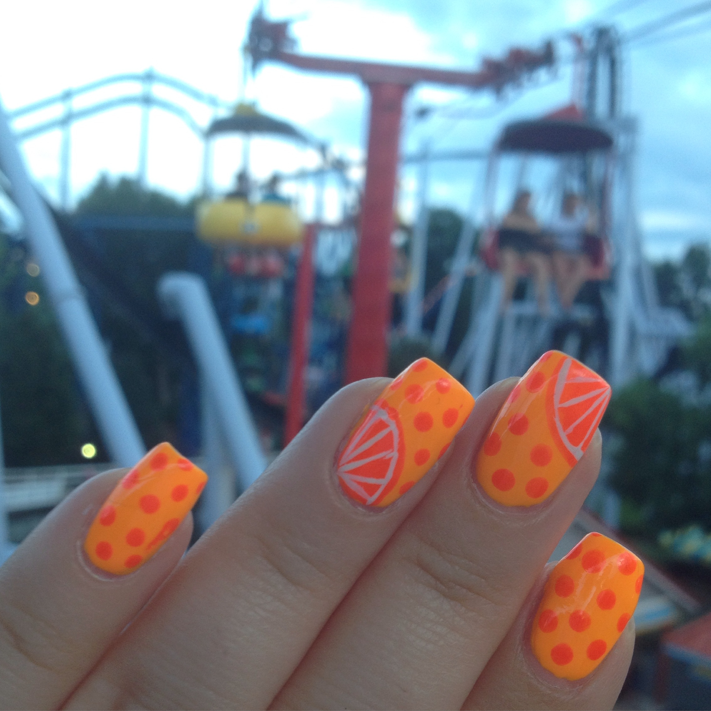
These are pretty cute, right?  Every summer I end up doing some sort of neon citrus mani.  This is like a pink limeade look or something. This look is so cute with any combination of neon pink, orange, green, or yellow.  The trickiest part is painting the little white lines on the citrus.  I use my tiniest brush and acrylic paint for that part.  These nails just make me happy.

IMG_7674 
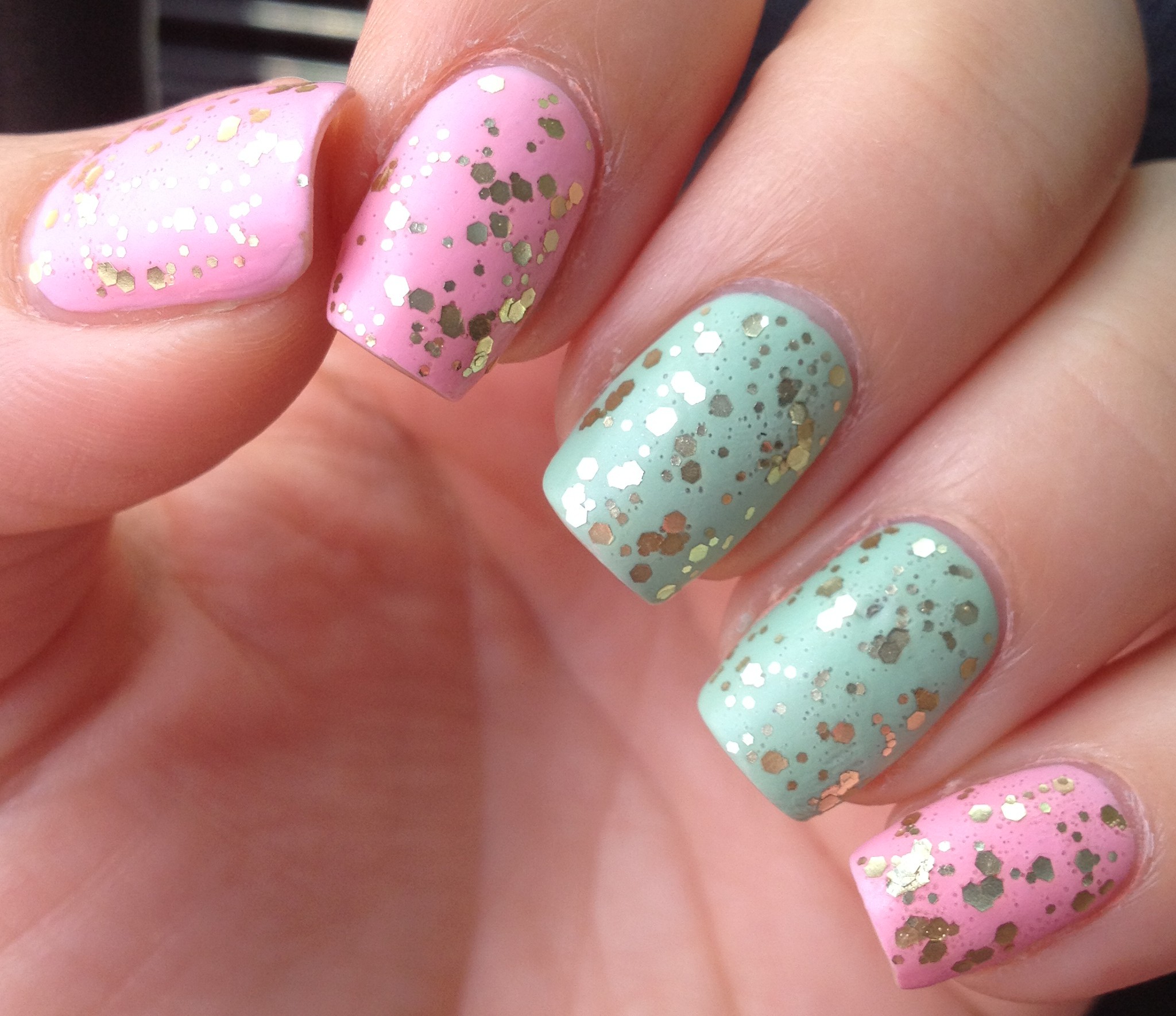
I really liked these nails too.  The base is Funky Fingers – Mattely in Luv and the polish I used for stamping was Funky Fingers – Sandy Toes.  Sandy Toes is a really interesting color.  In the bottle it looks like a bright, but not neon red polish that leans a little pink.  When you us it for stamping, however, it turns out to be a neon coral color.  And this polish, even in the bottle glows under my black light, so I guess it is neon, even though it doesn’t actually look neon.  In my head, that’s the test if something is neon or not:  whether it glows under a black light.

These nails are pretty loud, right?   I’m pretty sure that I had some jumpers or scrunchies IMG_8015or something that looked like this in the late ’80s. I used the homemade decal method to do these, which turned out to be an error in judgement, so they look a little  messy.  If I do these again, I would paint my nails white and add a top coat.  Then I would use painters tape to block of the section of the nail that I wanted to be neon.  Next I would stamp the black pattern over the nail and quickly peel the painter’s tape off.  Then I would add the neon polish.

I went through a little spell this summer where I was into reverse stamping.  It’s pretty IMG_7941time- consuming, so I pretty much just stuck to doing accent nails. The effect is pretty cute, though!  This also gave me a chance to use IMG_7966some of my colored glitter polishes that don’t always get enough love. Ooo, I’m looking at that pretty  deep yellow polish and I think I might need to pull that one out again before summer is over.  I’ve got a fair complexion (sounds so much nicer than pale) and it’s hard for me to pull off yellow clothing.  Nail polish is a great way to wear a color that is a little trickier for you to pull off..  IMG_8999

What’s more summery than beach nails?  For these, I started with a coat of white polish and then I did a blue-to-white-to-khaki gradient with a damp makeup sponge.  To get the white swirls,  I used the same technique that I wrote about in detail here.  Really easy and such a cool effect!  These look so much more complicated than they actually are.   IMG_8163

I also wore some cute dry brush nails.  I enjoy dry brushing so much!  It’s seriously the easiest nail art ever.  It can barely be called art, it’s that easy.  Neon colors over a white base.  So cute, so easy, so summery.

IMG_8228And these nails…. I’m not really sure what I was going for here.  I think I saw a picture on pinterest.  They can’t all be winners, am I right?  The neon glitter polish on my middle finger Bitzy – Sweetie Pie.  Bitzy is a new makeup line that is exclusive to Sally Beauty Supply.  They are only $1.59 per bottle, and they have lots of fun polishes.  They are a great way to expand your collection without breaking the bank.  FullSizeRender

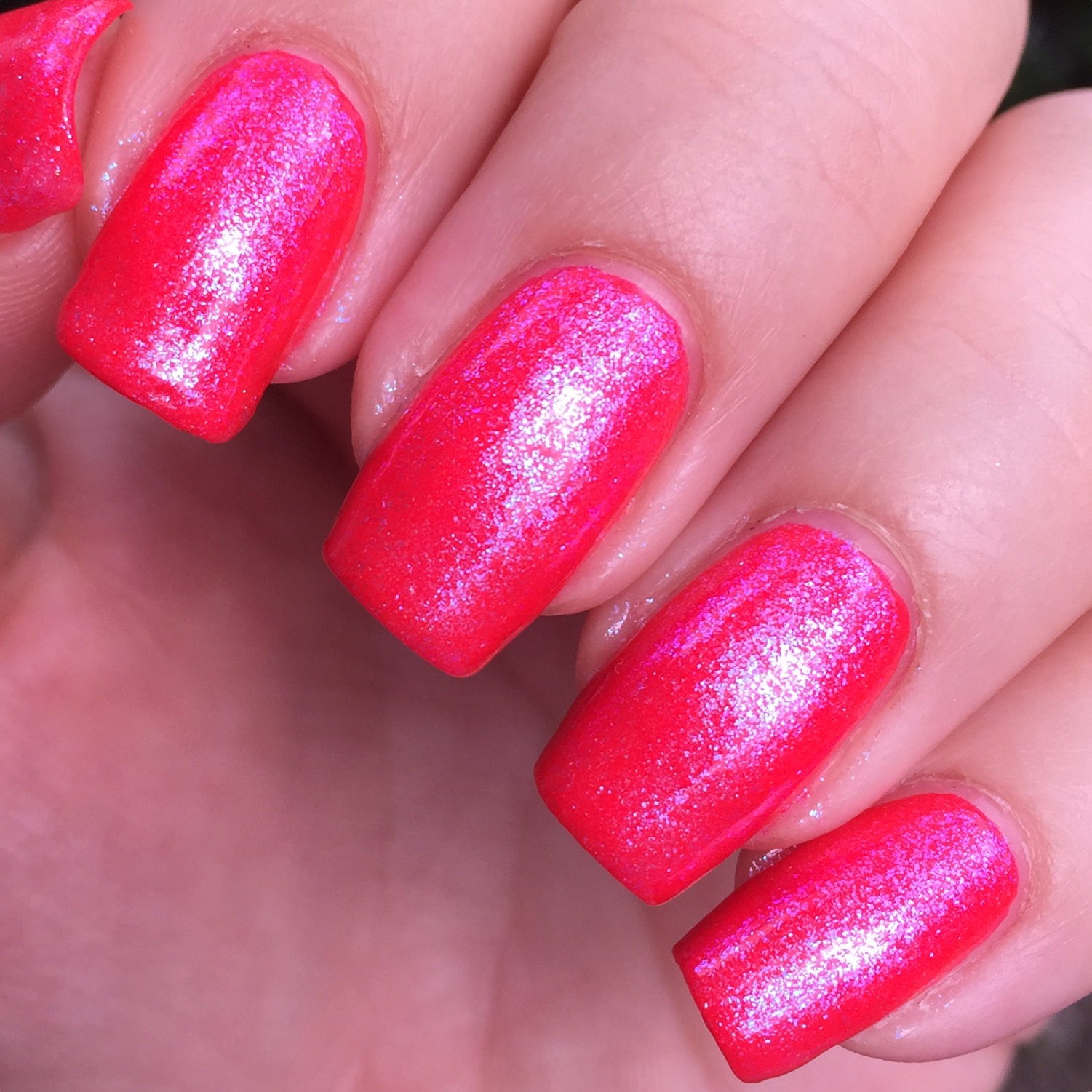
These are fun, right?  I have  a neon red polish that is just so darn bright that it actually makes me self-conscious to wear it.  I love it in small doses, though.  This was the perfect way to get just a little pop of neon into an otherwise classy manicure.  It’s a bit tricky to paint the underside of your nails, especially where your nail is connected to your finger, but I loved the effect!  I think there are so many fun combinations that you could do.  In October I might try deep purple nails with a neon orange underside.

These nails are kind of classy, I think.  This is just some gold stamping over purple nails.  Nothing fancy but they’re just pretty.   I’ve IMG_9055been doing a lot of nail stamping lately.  I realize that it’s sort of the lazy person’s nail art, but it’s just so fast and easy!  I still love doing the IMG_9070occasional freehand design, but right now, I’m definitely in a stamping groove.

Here’s another easy look thanks to nail stamping.  This is just a metallic teal polish stamped over a nude polish.  Metalic polishes tend to stamp really well.

IMG_8976And here’s one final mani.  If you’re not into freehand designs, and you don’t have any nail stamping stuff, you can always get a really fun look with a glitter topper.  Bitzy has a lot of really fun glitter toppers and so does Funky Fingers at Five Below.  (Yes, you are allowed to shop in there even if you’re over the age of 14.)  I think polish combinations like this look really fun with a matte top coat.

So those are the nails I’ve been wearing for the past few months.  If you have any questions about any of these, please ask!  Thanks so much for reading!

Lots of Winter Nails

Wow, I’ve been a slacker of a blogger.  Shame on me.  I do have a legitimate excuse, though.  For the past few months we’ve been really involved with an elderly family member who has been dealing with some health issues and major life changes.  There are some seasons of life that are just a little extra stressful and busy and sometimes you have to shuffle your priorities around.  For me, that meant taking a little break from blogging.  I think life will be returning to “normal”, so I should be able to get back to posting more regularly.  I know, you were all so worried.

While I haven’t had the time to write about my nails, I have still been doing my nails.  I thought I would just do one big post to sort of catch you up on some of the looks I’ve sported over the past few months.  Here we go..403

I kicked the year of with these sparkly guys!  I just can never get enough sparkle.  The sparklier, the better.  I know I’m really getting up there in years, and I suspect some people feel that super sparkly nails are not age appropriate for me anymore, but I just love glitter so much.  So pretty.  So sparkly.

Speaking of sparkly nails…

IMG_6867Let me just get all of the sparkly nails out of the way.  I think I like to wear sparkly nails over the winter months because in the warmer months, I tend to go for cream formulas in neon and pastel colors.  Metallic and glitter nails just seem too “heavy” for warm months.  Do you know what I mean?  Plus, snow is sparkly, so there’s that connection.

I did these glitter placement nails for a Weekly Nail Art Challenge (#wnac2016) on instagram.  The theme for the month of January was Glitz and Glam, and one of the weekly prompts was Diamonds.  Instead of opting for a design like a diamond gemstone,  I arranged some glitter in the shape of a IMG_7046diamond.

Here are some other really sparkly nails I wore recently.  The darker base polish is Rimmel London – Diamond Dust, and the ring finger is Funky Fingers – Sand & Stilettos.  That wasn’t sparkly enough, so I topped everything with a holographic glitter topper, Nicole by OPI – Party Bus.IMG_7051

I had the foresight with these to use a peel off base coat, otherwise it would have taken about two gallons of acetone to get this off my nails.

IMG_7039

Here’s a new polish that I picked up.  This is Revlon – Scandalous.  The top picture shows it with a matte top coat, the bottom shows a glossy top coat.  (Sometimes it’s a serious struggle deciding on what kind of top coat to use. )  I think polishes like this are perfect for this time of year.

IMG_6975   And here is the final set of really sparkly nails.  This polish is from China Glaze’s newest collection called House of Color.  This polish is called Moonlight the Night and oh my word, it is amazing.  When you look at it in the bottle, it kind of looks like it’s iridescent glitter in a blue base, but it’s not.  The base is actually clear, but there are translucent purple and blue glitter along with iridescent glitter.  When you put it over white, the iridescent glitter shows up as just a pale peach color.  When you layer it over black, the blue and purple glitter aren’t really visible, but the iridescent glitter shows up as bright orange and green and teal.  It’s wild!  I try to refrain from telling people that they NEED to pick up a specific polish, but you won’t be sorry if you pick this one up.

Here’s another new polish I picked up.  This is Sinful Colors – Rose Dust. I think this is just IMG_6875the most beautiful color, and I think it would work for pretty much all skin tones. This color just makes me feel pretty.

Months and months ago, I picked up some nail foils on clearance at Rite Aid.  Then they just sat around collecting dust.  One of the prompts in January for IMG_6904#wnac2016 was foil, so this was the perfect opportunity for me to finally give them a try.   I really liked how they turned out.  Perfect for wintry weather and SO SHINY!  By the way, if you’d like more information on how I did these or any other nails in this post, just let me know, and I’ll see what I can do.412


I also took another stab at water marbling.  Yep, it’s still a pain in the arse.  I made this picture small on purpose, because the less you can see it, the better it looks.  Trust me.

IMG_6985
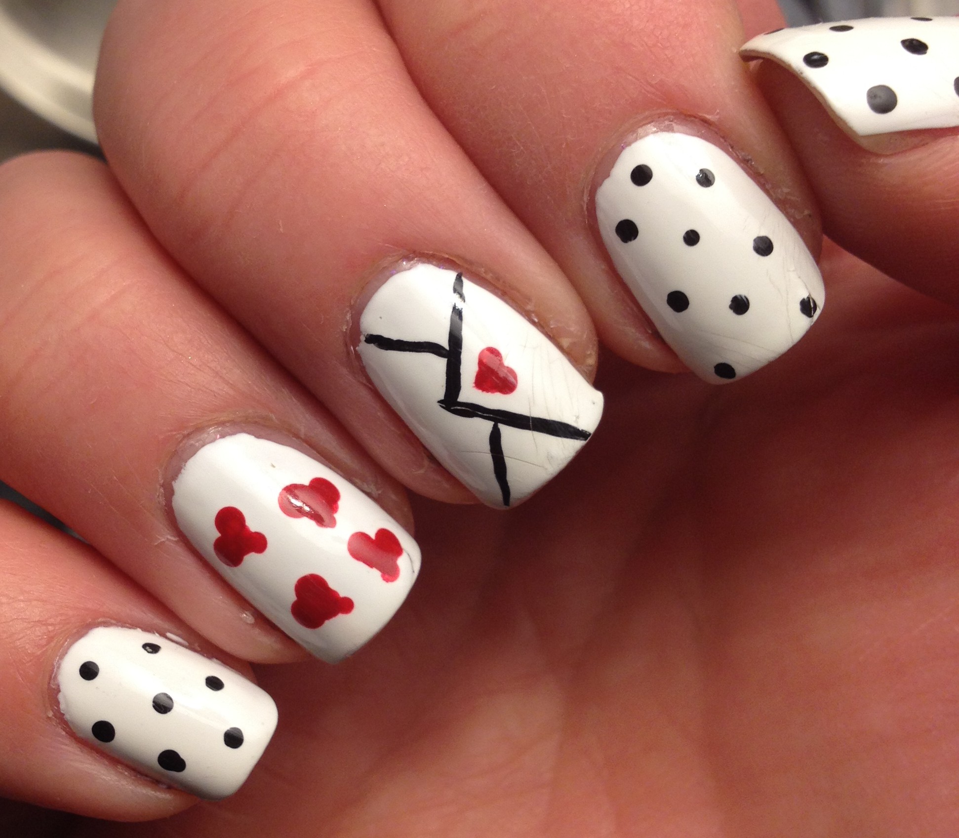
Now these gradient heart nails were some of my favorite nails that I’ve done in awhile.  They are super cute, right?!?  I just sponged on a gradient with a bright pink, a purple-ish pink, and a bright purple and then topped it with Sinful Colors – Love Sprinkles, a limited edition polish that I picked up last Valentine’s day.  For my accent nail, I painted it white and then applied a quick dry top coat.  Then I cut a little heart out of painters tape and stuck it on my nail and then did the gradient over the tape.  Then I peeled the tape off and topped it with 428Love Sprinkles.  I sort of felt like these nails were 20 years too young for me, but I loved them anyway.

I also did these “quilted” nails.  I didn’t love how they turned out, but they can’t all be winners.  I did take pictures each step of the way when I did them, so if you want to see a tutorial on these, let me know.  If you don’t want to see a tutorial, I’m not offended.  I know they’re not the greatest.

And here are the nails that I’m actually IMG_7055
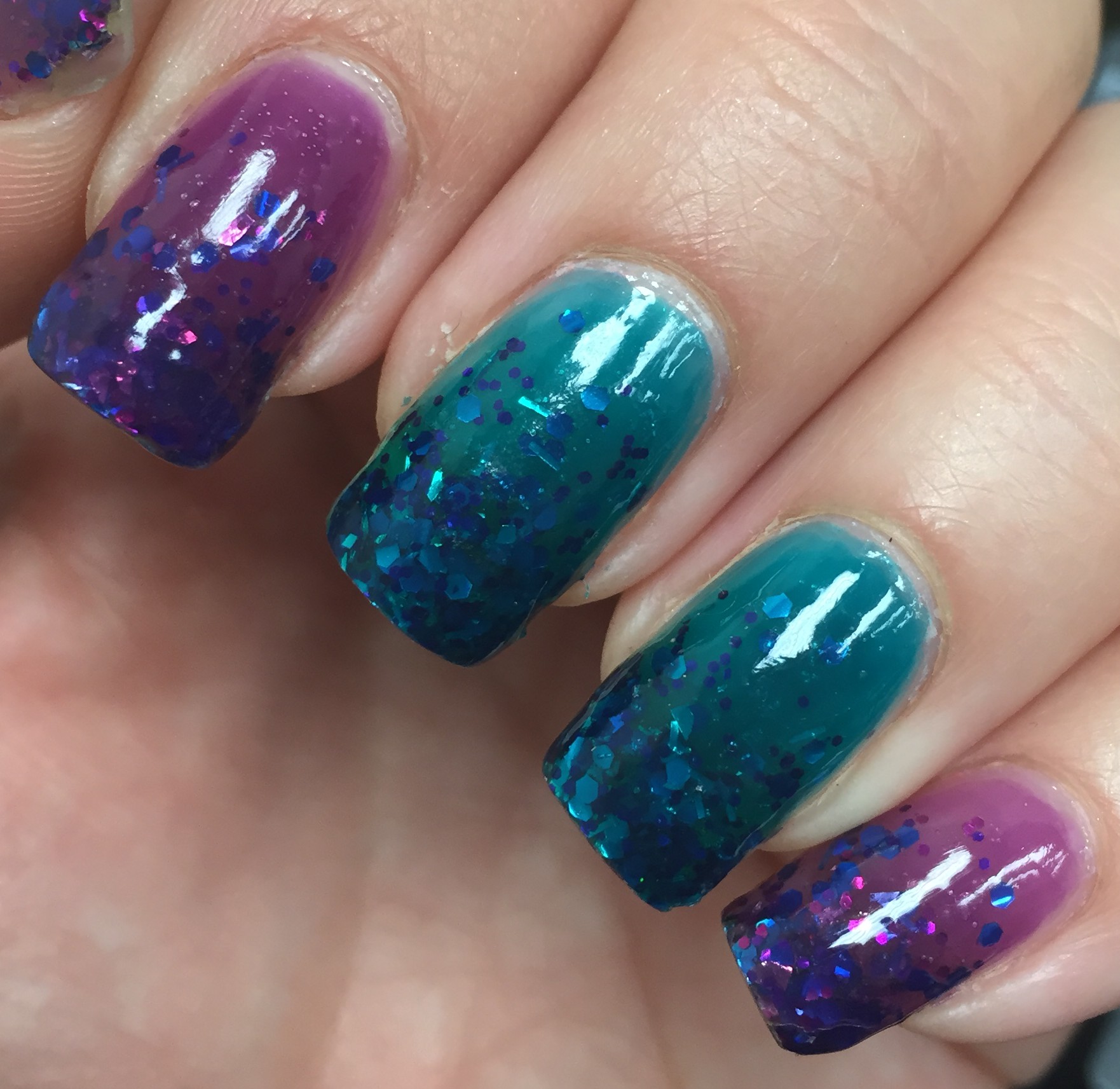
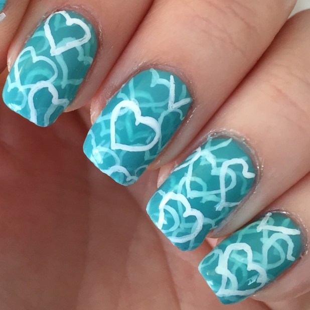
currently wearing.  This is a pond mani using Wet n Wild – Gyp-Sea Green, a limited edition polish from a few years ago.  It’s a really sheer jelly polish, so I actually started with a base of Wet n Wild Megalast – I Need a Refresh-Mint.  (I have the old formula which is a dead on dupe for China Glaze – For Audrey.)  Then I used white craft paint to paint a few hearts on each nail.  Then I added a coat of Gyp-Sea Green followed by a few more hearts, followed by another coat of Gyp-Sea Green, followed by more hearts,…  I lost track of how many 414layers I actually did.  I just kept going until I felt like they looked like I wanted them to look.  They are pretty cute, I think.

And I finally decided to dive into the world of nail stamping.  I have had a cheap stamper and a few really dinky stamping plates on hand for 3 or 4 years, but I just finally decided to use an Amazon gift card that I got for Christmas to get myself some reall stuff.  I got a Winstonia marshmallow (sticky) stamper and eight Born Pretty Store stamping IMG_6930
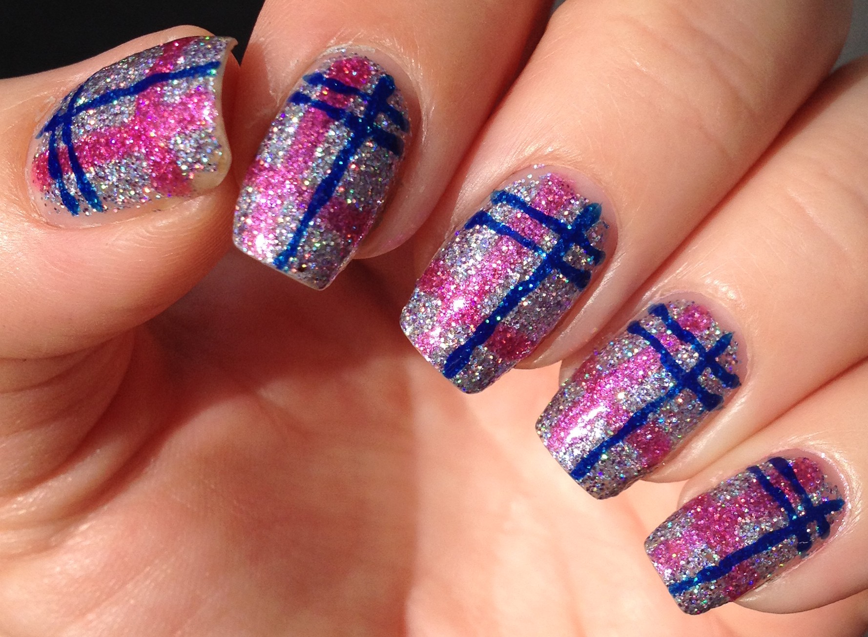
plates.  There’s been a definite learning curve to the whole thing, but I’m getting better!  I did the quilted nails the day after I got my stamping stuff, and you can see my so-so attempt at stamping on my index and pinky fingers.

Here are some plaid nails I did using my stamping stuff.  You can see that my pinky is IMG_6970sort of wonky and crooked, but hey, I’m still learning.

I have always thought that stamping was sort of nail art for cheaters, but I’ve sort of changed my mind.  I still have way more respect for awesome freehand designs, but lets face it, we can’t all be Jaunty Juli .  (She’s awesome, by the way.)  Stamping lets you get really intricate designs on your nails reallyIMG_6841 quickly, while still allowing you to feel creative.

These French tip nails were my first attempt at reverse stamping. These turned out not too bad, but I definitely want to get better at this technique.IMG_6958  This was one of those “they looked better in my head” situations.

And the final set of nails that I’ll throw at you in this post are these newsprint nails.  I actually started with a white base and used a Sinful Colors – Rose Dust to stamp a delicate design on my nails.  Then when they were dry, I dipped pieces of news paper in rubbing alcohol and pressed them onto my  nail for about 30 seconds.  I opted for a matte top coat with these, because that just seemed appropriate for IMG_7014newsprint.  I really liked how these turned out.

Again, if you want me to go into more detail about how I did any of these nails, please let me know, and I’ll be happy to provide a tutorial.

If you’ve made it this far, thank you for reading!  As my life gets back to normal, I fully anticipate getting back to a more regular blogging schedule.  Have a blessed weekend, everyone!


Pretty, Ugly-Pretty, or Just Ugly?

Hi!  I’m back!  Where have I been, you may or may not ask? Well, my hubby and I took a two week trip to London for our  10th anniversary, and it was awesome!  It’s a big city, so I can’t claim that we saw everything there is to see, but we did visit a ton of IMG_5452great places.  In a nutshell, we tackled to varying degrees: the London Eye, Tower of London, The Tower Bridge Exhibition, Shakespeare’s Globe Theater, Wimbledon, Notting Hill, the British Museum, Les Miserables, Buckingham Palace, Abbey Road, the British Library, IMG_5851Kensington Palace, Hyde Park, Speaker’s Corner, double-decker buses, a river tour, Greenwich, Piccadilly Circus, Oxford Street, Harrods, All Souls Church, the Tube, Big Ben, lots of pubs, lots of tea and scones, and lots of other stuff.  We got out of London for a day and visited Windsor Castle, Stonehenge, Bath and Lacock.  We had awesome weather, we learned tons of stuff, and just really had a super great time!  So, that’s where I’ve been.  Now back to nails….

This time of year, all of the nail people start talking about ugly-pretty colors.  These are colors that look like that could have been inspired by something gross you encountered in the bathroom after a night of bad choices.   To put it frankly, most of the colors that are described as ugly-pretty look like they could either be poo or puke.  Or maybe they are just colors that are inspired by nature at this time of year.  I mean, the grass is browninsh green, the leaves are all shades of green/brown/yellow/orange.  Maybe that’s it.

All of the ugly-pretty talk on youtube and instagram put me in the mood to do a full manicure of an ugly-pretty polish that had been sitting on my shelf for awhile.  It’s China Glaze – IMG_6256Budding Romance from the Avant Garden collection that came out in the spring of 2013. I picked this one up on clearance IMG_6255for super cheap a year or so ago.  At the time I bought it, I definitely thought it was ugly, but #1. It was really cheap, and #2. I didn’t have any other color like it.  I’ve used it in nail art a time or two, but I’d never done a full mani of this.   I figured it was time, and what the heck?

You know what I found?  I actually liked how this color looks on me!  IMG_6257Generally warmer tones don’t work well on my fair pink skin, but I actually liked how this worked with my skin tone.  And it was just so shiny!  Plus, it’s pretty much the same color as olives, and I LOVE olives!

My hubby, on the other hand, didn’t love it.  When I asked him his opinion, he furrowed his brow and declared it to be not one of his favorites.  Fortunately, it’s just nail polish and I change it frequently, so it did no permanent damage to our relationship.  I should add that he also hates olives.

So, what’s your opinion of nail polish in gross shades of green, yellow, or brown?  Do you have any favorite ugly-pretty polishes?  Or do you just prefer to stick with pretty-pretty polishes?

August Nails

In August I was a bit of a slacker in the nail art department.  I ended up wearing a lot of neon polish,.  I was feeling that summer-is-coming-to-and-end crunch, and I felt like I needed to squeeze in as much obnoxiously bright polish as possible.

IMG_5262I found a little bottle of China Glaze – Celtic Sun for $2.49 at Sally Beauty Supply, so I finally added this one to my collection.  Although I have a few neon yellows, this is truly the brightest of the bunch.  This polish will definitely get you noticed, if that’s your goal.

IMG_5195I enjoyed adding some shimmery toppers to my neon polish, too.  Here is an unnamed Sally Girl light neon pink that is really similar to China Glaze – Shocking Pink topped with Valley Girl Lacquer – Profundity.  I opted for a matte top coat, too.

Valley Girl Lacquer is an indie polish shop on Etsy.  She’s got some really  cute polishes.  Check out her shop! (By the way, I don’t have any relationship with Valley Girl Lacquer; I was just given some of her polishes as a Christmas gift by my sis.)

IMG_5185

Here is Orly – Fireball topped with Valley Girl Lacquer – Enigma.  Fireball is a beautiful neon red with a blue shimmer in it.  Unfortunately, the blue shimmer didn’t really show up on the nail as well as it did in the bottle.  Fortunately, I had Enigma on hand, so I added my own shimmer!

IMG_5151I also had some fun with glitter in August.  Here’s a gradient I did using LA Girl Color Pop – Rebel over my natural nail.  I’ve only ever seen the LA Girl Color Pop polishes at Rite Aid, and they are pretty inexpensive.  They are often on sale for two for $4.

IMG_5159While I was wearing this glitter gradient, I was given two of the Essie Silk Watercolor polishes.  Since I was pretty much dreading removing this glitter, I opted to make it last a little longer by topping it with the Essie polishes.  The purple color is No Shrinking Violet and the teal is Pen and Inky.  So fun and shiny and squishy!

IMG_5285I did actually do one bit of legitimate nail art in August.  After all of the bright colors, I felt I needed something a little more subdued, and it had been ages since I had done some simple, classic leopard print nails.  Leopard print is really so easy and takes very little skill.  After applying my base color, I just used the brush of the metalic-y bronze-y brown polish to make my spots.  Then I used a little dotting tool to quasi outline the spots in black. (A toothpick would work just fine for this step.)  Then I filled in any extra spaces with black dots or “C” shapes.  It looks way more complicated than it actually is.

Just a little aside:  This pattern is sometimes referred to as cheetah print, but if you look at actual cheetahs, you’ll notice that they just have regular black spots.  Leopards are the ones who have this circular type pattern.

So, that’s what happened on my nails in August!  My next post is going to be non-nail stuff.  Through influenster.com, I was sent some products to review, so I’ll be covering those items next.

Oh, and just in case you were wondering… I’m not tackling the 31 Day Challenge this September. I just knew that with some of the other things in life that I have coming up this month, I wouldn’t be able to do it justice.  I love checking out what other nail art lovers are doing for #31dc2015, and I’m a little sad not to be joining in.  Maybe next year.

Thanks for reading!

Just a Bunch of Summer Nails

And the award for Most Infrequent Posting goes to…. ME!  I apologize for my absence.  I’m sure it’s left a gaping hole in your summer.  I’m here and I’m fine and I’m still painting my nails.  I’ve just been busy.  It’s summer, so I can be outside doing stuff.  In a few months it will be cold and miserable and I’m sure I’ll be posting much more regularly then.

I thought I’d just highlight a few manicures that I’ve sported over the past month or so.  Here we go…

IMG_4983Turquoise and red with white polka-dots.  Aren’t these cute?  I really liked them.  I didn’t know until I did them how retro-looking they would be.  And they were so shiny!  These were super easy, too.  You only need a dotting tool.  This is such a fun way to try out different color combinations.  I wish I had a dress that looked like these nails.

IMG_5005

Glittery plaid print.  No picture could do these proper justice.  The base polish was Funky Fingers – Sand & Stilettos which is a crazy sparkly holographic micro glitter.  It’s like camping… It’s in tents.  (Intense.  Get it?)  The pink and blue polishes were both jellies,so the glitter was still visible.  So, so sparkly.

IMG_5019 Dry brush tie-dye.  I started with a white base and then just did a little dry brushing, starting with the yellow at my cuticles.  I just made sure that each of the colors overlapped a little.  The dry brush technique is super easy, by the way.  You just wipe almost all of the polish off the brush on the neck of the bottle and then drag the “dry” brush over your nails.  No tools or artistic skill required!

IMG_5031Neon orange citrus nails.  I should call these neon orange orange nails.  The base color was Orly – Tropical Pop and the darker orange was a Sally Girl polish from Sally Beauty Supply.  To pull off orange polish, I always have to wait until I get a little bit of a “tan”. I don’t really tan.  According to my foundation, I go from “fair” to “light”.  These were so bright, but you know how it is to photograph neons.  IMG_5040

Oh, I also took a picture of these nails while riding the Sky View at Hersheypark.  I really, really liked these nails!  By the way, Hersheypark is where I spent a significant amount of time in June.  It’s an awesome place to go before the crowds get really heavy in July and August.

IMG_5045Metallic butterfly nails.  I’m not sure who came up with butterfly wing nails originally, but ever since I first saw them a year or so ago, I’ve wanted to try them.  I finally got around to it.  These were a little time-consuming, but not really too bad.  I was going to use a pink/purple/blue neon gradient for the base, but I opted for a softer, more realistic green/purple gradient instead.  I also went with a matte top coat to make it a little more true to actual butterfly wings, also.

IMG_4955 Wavy teal nails.  These nails just sort of happened.  I thought they might look like lace of maybe fish scales, but they ended up looking more like waves.   I pretty much just used a doting tool to make rows of dots that touched each other.  I started at my cuticle, and then just picked a contrasting color and overlapped the next row of dots.  I didn’t love these at first, but they sort of grew on me.  IMG_4963

Jaunty Juli recreation.  I can take no credit for this design.  Jaunty Juli came up with it, and lots of people have recreated them.  I had to jump on the bandwagon. Super cute, right?  That Jaunty Juli is so creative!

IMG_4940Matte pastel with gold glitter.  These are pretty much a recreation of some nails that I did last summer and really liked.  I just love how gold glitter looks under a matte top coat.  Its just so frosty and beautiful!  This is another fun way to play with color combinations that requires pretty much no artistic skill either.

So, Those are a bunch of my summer nails!  Between fancy manicures, I love wearing obnoxiously bright neon polishes.  Someday I’ll be too old and they will be out of style, so I’m going to carpe diem.

Thanks for reading, following, liking, commenting, sharing, and whatnot!

Love Note Nails

Here are the actual nails that I am wearing on Valentine’s Day.

IMG_4418It’s been a long time since I did a mani with a white base, and I forgot how bright and crisp it looks!  White looks great in the summer when my skin is a little darker, but it also works well with my pale winter skin.  I also forgot how great a simple doticure can be.  (Side note: My hubby asked me what dots have to do with Valentine’s Day.  He takes things very literally.)

I’ve seen lots of manis online with this cute little love note design.  I can’t take credit for it!  I think that Hannah, an Aussie nail blogger first came up with the design.  This design is so simple, but so cute!  Check her out: http://thenailtrail.com.au/  I’m a little jealous of her beautiful nail art, and I’m really jealous that she’s enjoying summer weather right now.  Here in PA, we are getting wind chills of 20 below 0 Fahrenheit this weekend.  Darn arctic blast.

I did this design for the Weekly Nail Art Challenge on Instagram.  This challenge is great for a couple reasons.  I like that it is only once a week, so that’s very doable.  I also like that there is a monthly theme (February’s is Contrast) and then weekly prompts.  This week’s prompt is Valentine’s Day.  I didn’t really have any great inspiration when it came to the contrast element of my mani, so I just opted to use contrasting colors.

I started by painting all of my nails white…. Obviously.  The black and red are just craft paint.  So much easier to clean up than nail polish!  I used a small dotting tool for the dots on all but my middle and ring fingers.  Then, using my tiniest brush, I painted the envelope design.  I started with the “V” that makes the outer flap of the envelope, and then added the other lines.  Then using my tiniest brush dipped in red, I wrote the word “love” on my ring finger.  Since I’m pretty terrible at writing with my left hand, I ended up just doing a few hearts on my ring finger on my right hand.IMG_4422

I find that the easiest way to make hearts is to use a dotting tool to make two barely touching dots.  Then I use either a small brush or a dotting tool to drag the dots down into a point.

I debated a bit whether I should make these matte or glossy… I was feeling in a glossy mood.

Well, that’s it!  Thanks for reading, following, and liking!  Have a great weekend filled with love!

XOXO Nails

I’d better quick get around to posting a few more Valentine’s Day nails before they become completely irrelevant!  Here’s a simple little look I did:

IMG_4355The base polish is LA Colors – Candy Sprinkles.  LA Colors polishes are generally about $1.50.  I know they sell them at Dollar General and cheap places like that.  My experience is that LA Colors polishes are kind of hit-or-miss, but since the price is right, I’m usually willing to take a gamble.  This is definitely my favorite polish in the line, so far.  I’m definitely going to be wearing this one again in the spring.

The designs on my middle and ring finger are all done with craft paint.  For both nails, I started by painting my design in white, and then when in with the colored paint, leaving a border of white showing.  If I had just used a solid color of polish, I probably wouldn’t have done the white background/border thing, but since the base color was heavy on the glitter, I figured it would be a good idea.  I think it helps the designs pop.

I have one more nail art design that I need to get posted here before tomorrow, so be on the lookout for that!  I know Valentine’s Day can be a depressing day for some, but just know that God loves.  You are loved more than you can know!  Thanks for reading and have a great weekend!

Conversation Heart Nails

Valentine’s Day.  Some folks love it, others hate it.  I rolled my eyes a lot at Valentine’s Day stuff when I was single, but since I’ve got a good hubby now, I find the day to be perfectly pleasant.  The lamest Valentine’s Day that I can remember was in 2003.  I liked a guy who totally had me in the friends zone.  The guy I liked had a roommate who was totally not my type, but he liked me.  Somehow on Valentine’s day, I ended up going to Wendy’s for dinner with both of them and then we went and saw Shanghai Knights (stupid movie).  I sat between the two of them in the theater… The guy I was pining for on one side, and the guy who was pursuing me one the other.  I was like Emma between Frank Churchill and Mr Elton…. I so glad I found Mr Knightly… And my hubby is older than me so this whole analogy really works well!  Anyway…

IMG_4249Regardless of your feelings on Valentine’s Day, it is the perfect opportunity to sport some cute nails.  Today I bring to you a simple conversation heart inspired mani.  This is so simple that it’s really not worthy of a tutorial.  I just painted each finger a different pastel color and then took my littlest brush in some craft paint and added the “conversations”.  I used red paint, but I added a little white to it so that it would be that sort of washed out color that you have on real conversation hearts.  I topped it off with a matte top coat.

While looking through my polishes for pastel colors, I realized that I had very few.  I actually ended up making the light orange and light purple polishes by mixing some of my polishes in with white polish.  The light green was a polish that I frankenpolished last summer.

To keep things real, here is my seldom seen Cinderella hand:

IMG_4247That is, the had that does all the work but receives none of the glory.  My right had never gets to go to the proverbial ball.  Never gets any of the praise on instagram.  If my hand had feelings, I’m sure it would feel a little put out.  Overworked and neglected.

Really though, painting tiny letters is not the easiest thing, and painting tiny letters with your non-dominant hand?  Extra hard.  That’s why you don’t usually see my right hand.  It’s usually just a sloppy version of my left hand.

Once in a while someone will ask me if I always do both hands, and the answer is yes, 95% of the time.  The only time that I haven’t always done both hands was back in September when I did the 31 Day Nail Challenge when I did my nails every day for 31 days straight.  A lot of those designs were really time-consuming and intricate, and I just didn’t have the time or the skills to always do my right hand.  Even when I wouldn’t make my right hand completely match my left hand, I would still do my nails on my right hand so that they complement my left hand.

Okay, I’ve rambled on far too much here, so I’ll wrap this up.  Thanks for reading, commenting, liking, and following!

Sparkly Red Snowman Nails

Let the Christmas manis begin!  Here’s how I kicked things off this year:

IMG_3992

The red and white are nail polish, but all of the details on the snowman are craft paint.  Here’s a better view:

IMG_3994

I was tempted to add stripes to his scarf, but I just didn’t quite trust that I wouldn’t screw up the whole thing.

Oh, and I must tell you about this amazing red polish.

IMG_3986

It’s Broadway Nails – Hot & Sexy.  It’s a red micro glitter in a red jelly base.  When you apply it to your nail, the glitter sort of sinks down so that the surface of the polish is incredibly smooth and shiny.  You know how some micro glitter polishes have a textured finish and if you want them to really be sparkly, you need to add like, four layers of top coat?  Well, this is not like that at all.  The sparkle on this polish has such depth!  I’m really going to have to fight the urge to make this the base of every Christmas mani.

That’s all for now!  Thanks for reading, liking, following and commenting!

Ferny Nails and My Pile of Untrieds

So, first off, here are some ferny nails that I did:

IMG_3905

These were inspired by Mr Candii Pants, who actually is a miss, not a mister. Check her out on youtube and/or instagram.  She does some of the coolest free hand nail art.

The base color for these was Fresh Paint – Firefly.  It’s an almost-white-but-actually-a-pale-bluish-grey color.  And it’s a one-coater!  By the way, do you prefer “gray” or “grey”?  I like “grey”.  It just seems like a nicer, softer spelling.

I painted all of my purple ferns first, then blue (I think), and then green.  It’s just way easier to do all of one color at a time, when possible.  I used a shiny top coat, but I think these would have worked well with a matte top coat also.

Now onto a completely different subject:  My untried polishes.  Here they are:

IMG_3936

Now, some of these are untried because I got them on clearance when they were out of season.  Others are untried because… I don’t know.  I don’t really have any good reasons.  I decided that I really need to tackle this pile, so I’m going to make a good effort to reach for these polishes until they are all tried!

I’ve tackled two so far.  Here’s Wet n Wild – Echo Dark from the recent matte collection:

IMG_3934

It’s a little tough to see, but I actually did a jelly sandwich with this polish.  I was pleasantly surprised that the polish still looked blue in person instead of black.  I didn’t love the formula though.  I can’t quite pinpoint why I didn’t.  It took a while to really dry, so my nails ended with some little marks in them.  That irritates me like crazy.

I also tried Sally Hansen – 3K or More:

IMG_3939

The sun came out for me, so I got a nice sparkly picture!  This is a nude polish with a gold shimmer in it.  I don’t know how I feel about this polish yet.  I feel like it looks really pretty in the picture, but I don’t think this shade of nude looks the best with my really light skin.  There’s a bit of a yellow undertone, and I generally do better with cooler shades.  It’s growing on me, though.  This is a good pallet cleansing polish.  After wearing Echo Dark for a few days, I felt like I needed something a little more neutral.  This polish might be a little hard to find.  I got this in a clearance bin awhile ago.

Oh, can you tell my nails are shorter in the last picture?  I had some nail peeling going on, so I just gave them all a chop before one just broke off.

Well, thank you all for reading!  Find me on instagram and facebook!